Project Type
- Mobile app UX
- Visitor experience platform
- CMS / experience builder design
- User flow design
- Wireframing
- Modular content system
- AR and QR-triggered interaction design
- Touch-free visitor experience
- Venue experience design
Platform / Tools
- iOS and Android
- CMS / web app
- UX documentation
- Augmented Reality
- Adobe XD
- Balsamic
Overview
Chaperone was a mobile visitor experience app designed for museums, galleries, heritage sites and other venues.
The app allowed venues to create story-led visitor journeys using modular content, triggers and configurable scenes. Visitors could check in, access venue-specific content, scan QR codes or image targets, receive directions, view audio, video and graphic content, interact with AR experiences, make donations, access offers, and receive notifications during their visit.
Alongside the visitor-facing app, the project also included an Experience Builder CMS. This allowed venues or value-added partners to configure the structure of the visitor experience, upload assets, create scenes, connect triggers, and build content journeys without needing to directly edit the app.
Context
The project was developed during a period where venues needed more flexible, touch-free and mobile-led ways of delivering visitor experiences.
The app needed to support a wide range of venue types, from small heritage sites with limited connectivity and non-technical staff, through to larger visitor attractions with more advanced infrastructure and integrated ticketing or concession systems.
The core idea was that the app would act as a reusable runtime. Each venue would configure its own experience using downloaded venue-specific content packs, media, triggers and scene structures.
This meant the design problem was not just a single visitor app. It was an ecosystem: a visitor-facing mobile app, a configurable content structure, and a CMS-style builder that allowed venues to create their own journeys.
My Role
I designed the Chaperone app and created the UX, user flow and wireframes.
My work included defining the visitor journey, designing the app structure, mapping how users moved from pre-visit planning through arrival, check-in, venue exploration, notifications, purchases, donations and departure.
I also designed the Experience Builder UX, including the scene hierarchy, module structure, trigger management, asset library, screen properties, hub configuration and content editing panels.
A major part of the work was translating a broad product concept into a usable system. The app had to feel simple for visitors, while the builder needed to support complex configurable experiences without becoming too technical for venue staff.
I also contributed to the design documentation across multiple versions, including post-workshop updates, wireframes, CMS overview, CMS iteration, user flow and technical investigation work.
Problem
The core problem was how to create a visitor experience app that could work across many different venues, content types and visitor journeys.
Venues needed to be able to configure their own experiences without requiring a bespoke app build for every site. Visitors needed a simple and intuitive journey, even though the system behind the app could include triggers, modules, layers, recommendations, ticketing, donations, AR, audio, video, maps and external services.
The app also had to support different levels of visitor engagement. Some users might only want a basic audio guide or direction prompt. Others might want premium content, AR photo opportunities, café offers, donation prompts or personalised recommendations.
The design challenge was to make this system feel coherent, both for the visitor using the app and for the venue staff configuring it.
Constraints
The system needed to support venues with very different technical capabilities.
Some venues might have strong infrastructure, ticketing systems and integrated services. Others might have limited connectivity and non-technical users responsible for setting up content.
The app needed to support touch-free interaction, including scanning QR codes, image targets, menus, ticketing codes and other venue defined triggers.
The Experience Builder also needed to expose the logic of the system clearly. Users needed to understand the relationship between hubs, areas, scenes, modules, assets and triggers.
The visitor app needed to stay simple. It could not expose the underlying complexity of the CMS, layers and trigger architecture to the visitor.
Approach
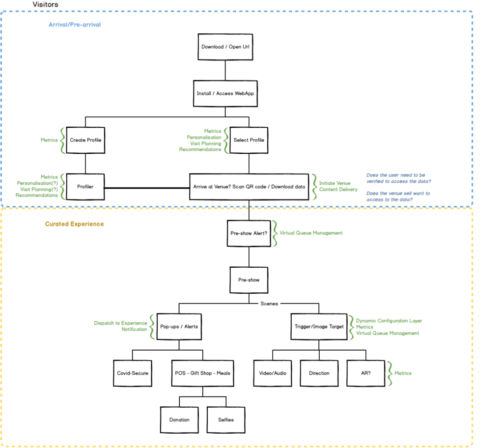
I structured the product around two connected experiences: the visitor-facing app and the Experience Builder.
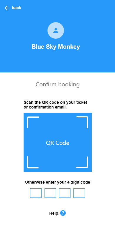
For the visitor app, I designed a guided journey that began before the visit. Users could read the Chaperone introduction and privacy information, create an anonymised profile, confirm their booking, view recommendations and prepare for their upcoming visit.
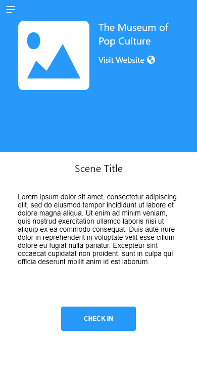
On arrival, the user would check in by scanning a QR code. This would configure the app for the venue and load the relevant content, user journey and media.
Once inside the venue, users would move through areas using the hub, scan triggers, access audio guides, view content, receive notifications, follow direction screens, access VIP areas, make café purchases, and donate to the venue.
For the Experience Builder, I designed a visual editor that represented the venue experience as a connected structure of hubs, areas, scenes and screens. Users could manage assets, create triggers, configure screens and define how each part of the experience connected together.
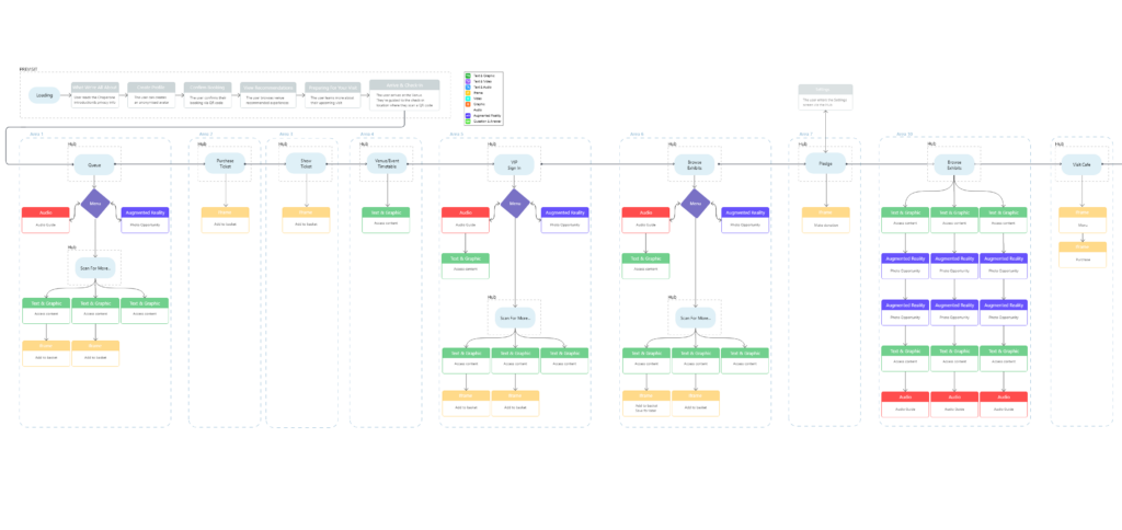
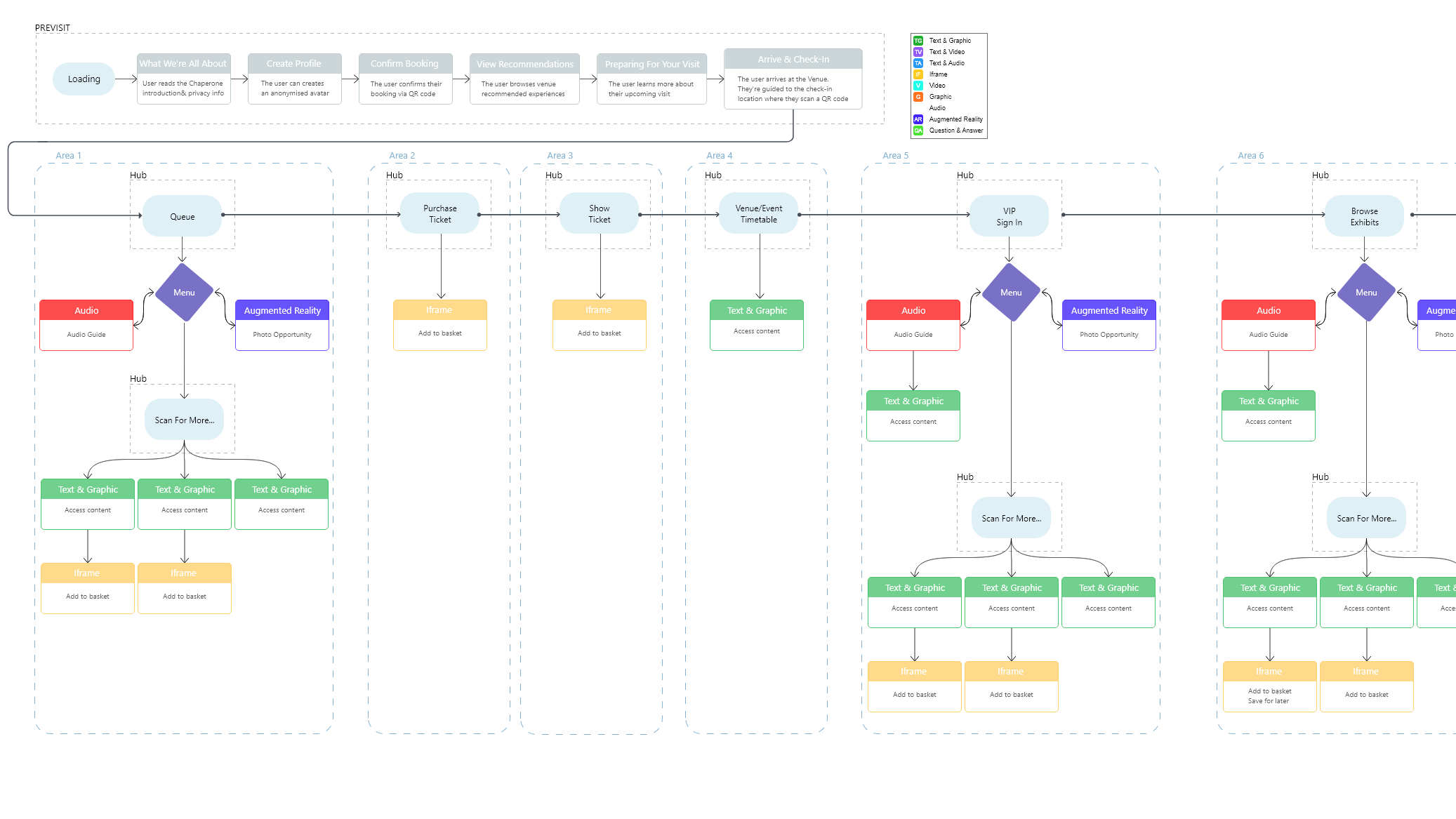
Visitor App Flow
The user flow was designed to cover the full visitor journey.
The pre-visit flow introduced the app, privacy information, profile creation, booking confirmation, recommendations and preparation content.
The arrival flow guided the visitor to the check-in location and asked them to scan the QR code on their ticket.
After check-in, the visitor entered the venue-specific hub. From there they could access content through scanning, buttons, recommendations, or triggered notifications.
The venue journey included examples such as audio guide content, AR photo opportunities, text and graphic information, iframe purchase flows, direction screens, gallery notifications, VIP access, café ordering and donation prompts.
This created a flexible journey that could support both structured tours and more open exploration.
Experience Builder
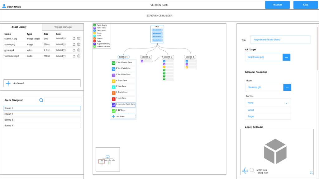
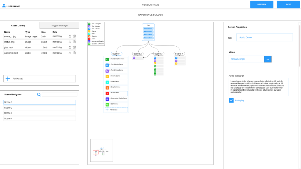
The Experience Builder was designed as the configuration tool for venues and partners.
The interface used a three-panel structure:
- An asset library and scene navigator on the left
- A central visual experience map showing hubs, areas, scenes and connected modules
- A properties panel on the right for editing selected screens, scenes, hubs or triggers
The builder allowed users to upload and manage assets, define triggers, create scenes, add screens, configure modules and connect parts of the experience together.
The visual map helped make the system understandable. Users could see how the hub connected to scenes, how scenes contained screens, and how triggers moved users between areas or content types.
Modules and Content Types
The design used a modular content system.
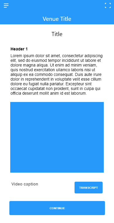
Modules included text and graphic content, text and audio, text and video, iframe content, standalone audio, standalone video, graphics, AR experiences, Q&A interactions and direction screens.
Each module had its own editable properties. For example, a video screen could include a title, video file, transcript, autoplay option, loop option and fullscreen option. An AR screen could include an AR target, 3D model, anchor selection and model adjustment tools. A Q&A screen could include question text, options, correct answer selection, button labels and timer settings.
This modular approach allowed a venue to create different types of experience without the app needing to be redesigned for each use case.
Trigger Design
Triggers were central to the system.
The design treated triggers as the link between the physical venue, user action and digital content. Triggers could include QR codes, image targets, on-screen buttons or other configured events.
In the Experience Builder, triggers could be created, named, assigned a type and connected to a target scene. This allowed venue staff to define what should happen when a visitor scanned an image, tapped a button, or reached a particular point in the experience.
This trigger-based structure supported the product’s “If This Then Wow” concept: a simple way for venues to build interactive visitor journeys without needing to write code.
Touch-Free Interaction
Touch-free interaction was a key design requirement.
The visitor app supported scanning venue-defined triggers such as QR codes, menus, ticketing codes, AR targets and object markers. This allowed users to interact with venue services and content from their own device rather than relying on shared touchscreens or physical interfaces.
This approach supported safer visitor interaction while also giving venues a route into remote ordering, digital content access, donations and interactive exhibit control.
AR and Content Experiences
The system included support for AR and image-triggered content.
AR experiences could be configured from the builder using a target image and a related 3D model. The system allowed for different anchor options, including world or target anchoring, and provided model adjustment controls.
In the visitor journey, AR was used for examples such as photo opportunities, object discovery and viewing 3D content linked to exhibits.
The wider content system also supported audio guide sections, video presentations, image and text panels, map-based direction screens, and iframe overlays for external services such as donations or ticketing.

Key Technical / Design Decisions
- Design Chaperone as a reusable runtime that could be configured per venue.
- Separate the visitor-facing app from the Experience Builder CMS.
- Use a hub-based structure so visitors always had a clear place to return to.
- Use areas, scenes and modules to break complex venue journeys into manageable parts.
- Use triggers to connect physical visitor actions to digital content.
- Support QR, image target, button and system-triggered interactions.
- Make the Experience Builder visual, so users could understand the structure of the experience at a glance.
- Use a consistent three-panel layout for asset management, visual structure and editable properties.
- Design screen modules around common content patterns such as text and graphic, text and audio, text and video, iframe, AR and Q&A.
- Support touch-free interaction from the visitor’s own device.
- Include visitor flows for pre-visit, check-in, venue exploration, VIP content, café, donation and departure.
- Keep the visitor-facing app simple while allowing the configuration system to handle complexity.
Outcome
The project produced a complete UX structure for both the Chaperone visitor app and the Experience Builder CMS.
The visitor-facing design mapped a full end-to-end experience, from pre-visit preparation through check-in, venue exploration, notifications, purchases, donations and departure.
The Experience Builder wireframes defined how venues could create and manage content-rich visitor journeys using assets, scenes, modules and triggers.
For me, this project was a strong example of systems-level UX design. I was not only designing individual screens, but the logic that connected a configurable platform, a CMS, physical venue triggers and a mobile visitor journey into one coherent experience.
Skills Demonstrated
- UX design
- User flow design
- Wireframing
- Mobile app design
- CMS design
- Experience builder design
- Information architecture
- Interaction design
- Visitor experience design
- Design documentation